For most of the last decade, grey set the tone. Cool, concrete-inspired and safely neutral, it was the default for floors, walls and everything in between, until it started to feel a little cold. Recently, warmth pushed back: earthy tones edged the industrial greys aside, bringing terracotta, clay and ochre back into the spaces we live in, and paint brands began retiring the flat, sterile whites and cool greys that defined the 2010s.
What’s changed in 2026 is the confidence of that warmth. The muted terracotta and soft ochre of recent seasons are deepening into something richer and more expressive: burgundy, oxblood, bronze and saturated rust. Forecasters have even given it a name: earthy vibrancy. The earth-tone palette has stopped whispering.
In short: 2026‘s boldest interior color trend has a name, earthy vibrancy. The earthy palette that grounded recent seasons and softened into warm minimalism, is now turning up the volume: deep, saturated tones like burgundy, oxblood, bronze and rich terracotta. It peaks in autumn, and it’s a material story as much as a color one.
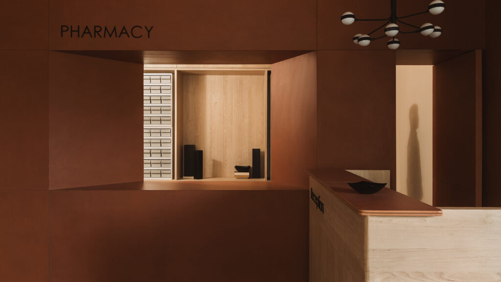
What defines the 2026 deeper earthy color palette in interior design?
The earthy palette arrived as a grounded, muted range – the terracotta, sandstone, ochre and mocha of 2025’s defining color trend – and it found a quiet, restrained form in warm minimalism, where clay and sage appear as gentle punctuation on a neutral base. Earthy vibrancy is the next step: the soft terracotta and honeyed neutrals stay, while the palette grows a deeper, moodier register above them.
That fuller earthy color palette reads as a spectrum. It runs through the mid-tones everyone knows: terracotta, clay and ochre, richer and less powdery than in recent years. What’s new is the depth beyond them, the shades the forecasts group as restorative darks: wine tones – burgundy, oxblood, merlot and pomegranate – grounding without going cold, alongside chocolate and espresso browns and warm metals like bronze that add a glow flat matte can’t. Deep, warm-leaning greens play the supporting accent.
What this palette is not is the cool, industrial darkness of charcoal and slate. Every tone here leans warm, drawn from clay, wine, wood and metal.
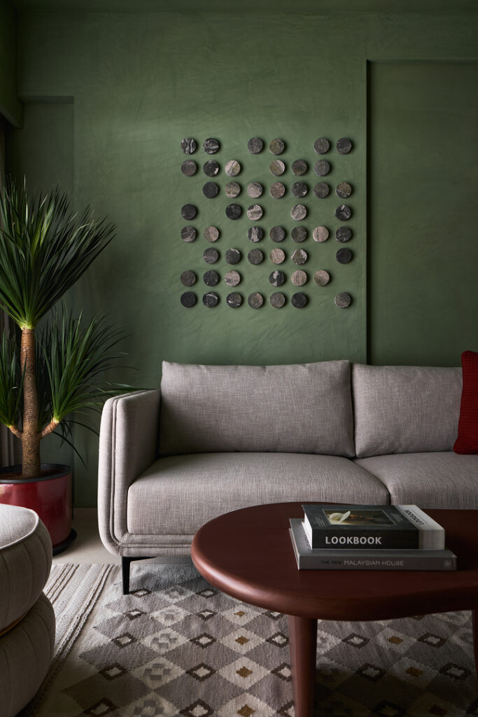
The autumn color palette and the craving for depth
As summer winds down and autumn moves in, the earthy palette steps into its season: the stretch of the year when it naturally pulls toward its richer end. The light, sandy tones that suit the warmer months give way to a deeper, more enveloping autumn color palette: burgundy, rust, chocolate and bronze, warmed further by low autumn light.
The move is emotional as much as seasonal. After years of pale, careful neutrals, there’s an appetite for rooms with more character, spaces that feel like a refuge as the days shorten. The forecasts frame these deep tones as restorative, built for cocoon-like comfort and layered, tonal richness: a quieter kind of confidence, where depth and subtlety read as luxury.
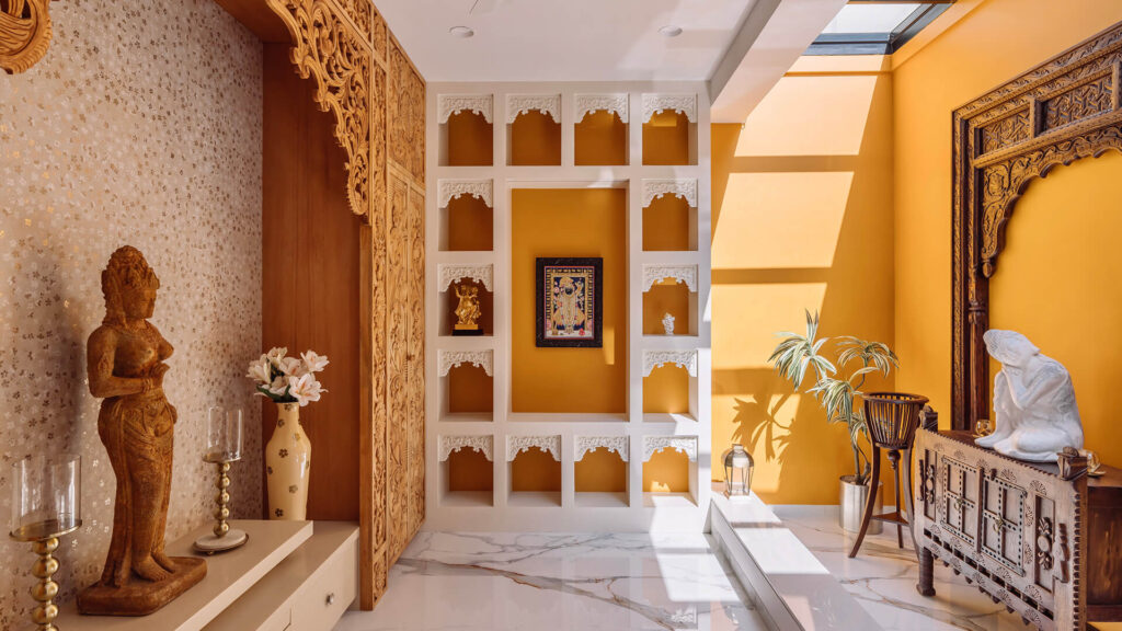
Where vibrant, earthy tones make their biggest impact
Deep color suits the rooms where atmosphere matters more than airiness.
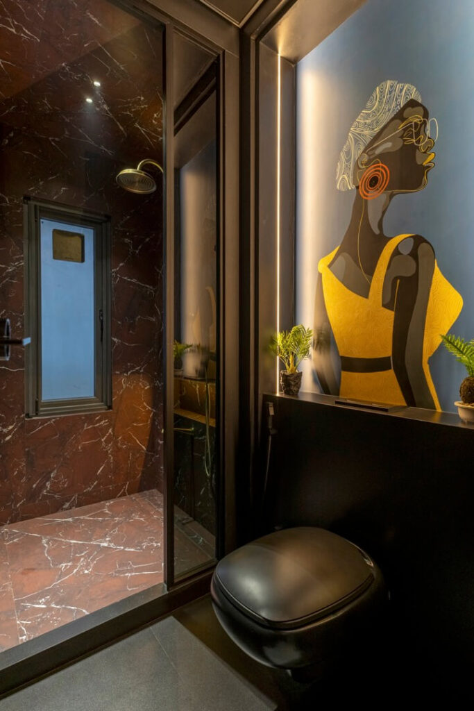
Living room
A single deep wall – burgundy, terracotta, or a bronze-veined surface behind the media unit – anchors the space, while lighter neutrals keep it from closing in.
Kitchen and bathrooms
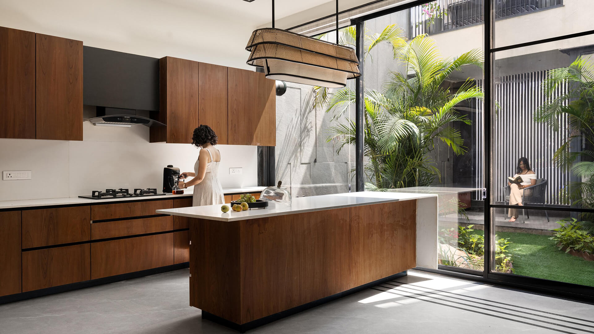
The kitchen is where these tones have already retired the all-white look: a clay or terracotta surface, a deep-toned island, or wood cabinetry makes a working room feel welcoming. A bathroom is the place to be boldest, a single wall in a deep oxblood or marble-effect surface reads as a jewel box precisely because the space is small and contained.
Bedrooms
Chocolate, espresso and deep clay bring a low, restful mood, best in matte finishes that keep the color soft.
Outdoor
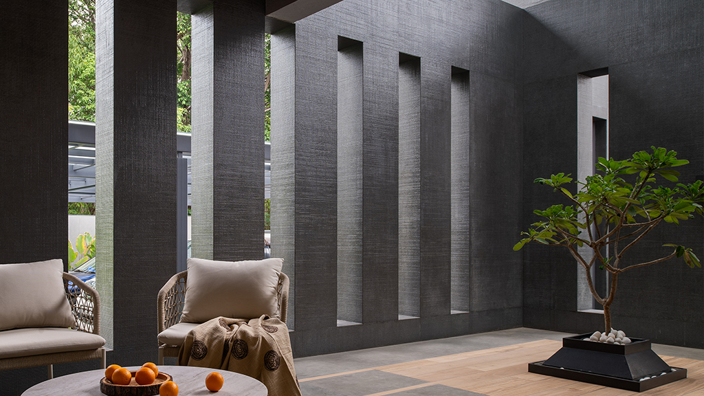
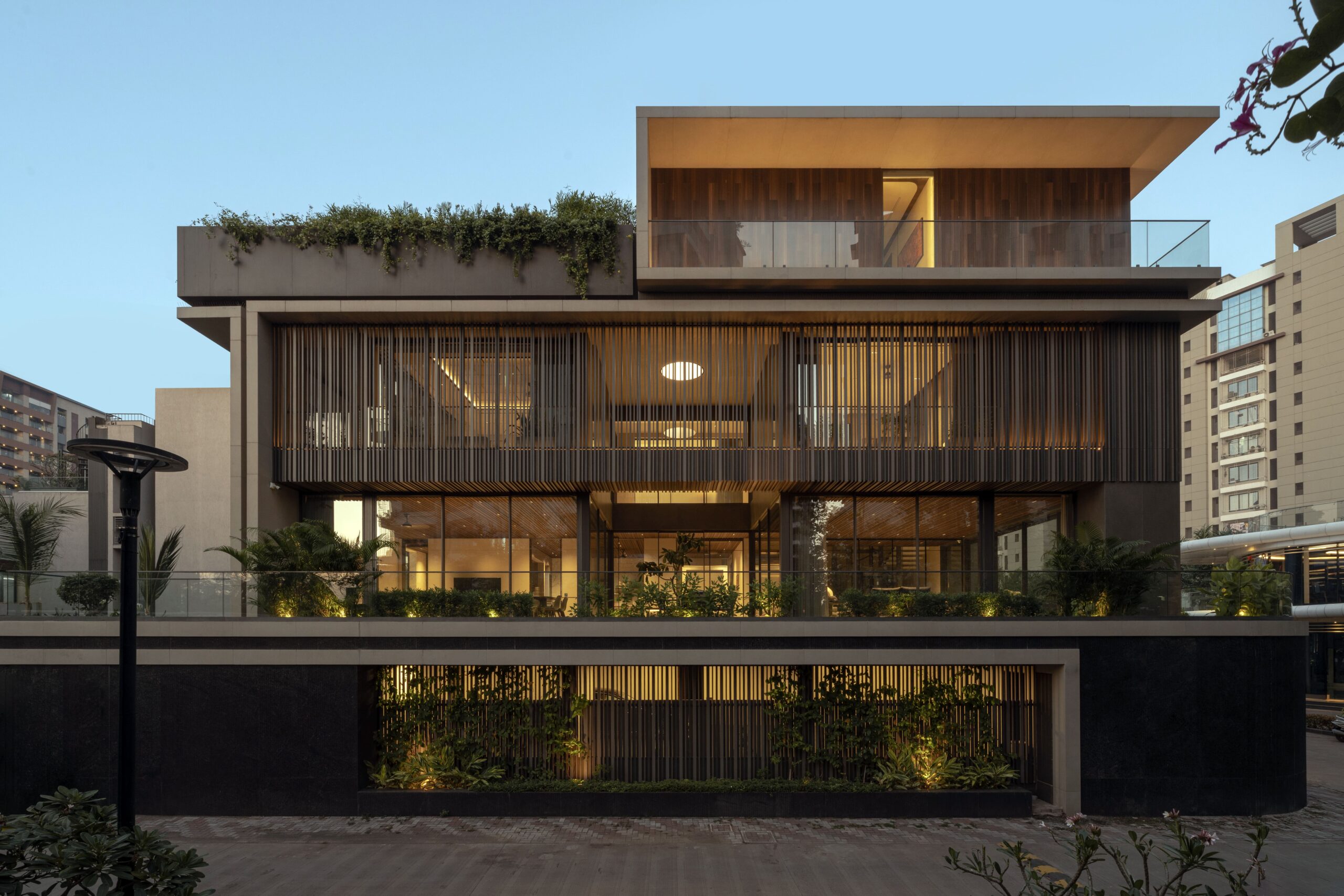
The palette carries outdoors as naturally as in. A terracotta or warm-stone facade, a deep-toned patio, or a courtyard wall in a rich earthy tone grounds a building in its landscape. Sintered panels suit the setting: UV- and frost-resistant, they hold their color through sun and weather, letting an indoor scheme run straight out onto a terrace in the same material.
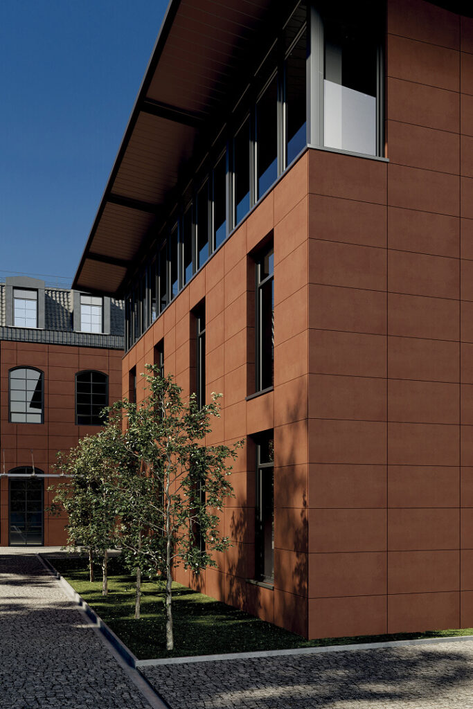
How warm-toned tiles bring it to life
Sintered surfaces carry a color as genuine material: real depth in a terracotta tile, real veining in an oxblood or a bronze. Fired dense and non-porous, they resist scratches, heat and UV, so a deep tone stays rich through years of use.
Nexion’s palette reaches this saturated end, drawn from a long Italian tradition of cotto and stone. The oxblood at the heart of the trend comes ready-made in Rosso Levanto, deep and richly veined, while Calacatta Bronzo adds the warm-metal glow the season calls for and the coffee-toned Frappuccino settles into chocolate-brown. Where a scheme wants something earthier and more tactile, the textured Terraelino collection brings the same depth with a hand-worked surface.
Matte, three-dimensional surfaces let a deep tone hold light rather than flatten it — exactly the tactile, layered quality the forecasts recommend for restorative darks.
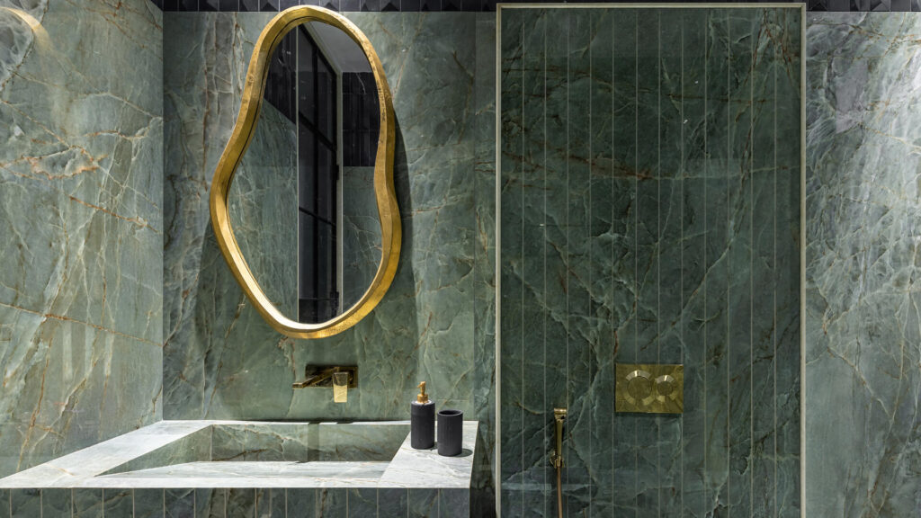
Bring earthy vibrancy to your next project
Deep earthy is, at its core, about surfaces with real warmth and depth. Explore Nexion’s sintered surfaces and give the 2026 palette genuine material depth.
Frequently asked questions
What are the deep color trends for 2026?
The clearest direction is a family of warm, saturated restorative darks – burgundy, oxblood, plum, chocolate and deep terracotta – alongside warm metals like bronze. They’re the deeper, more confident evolution of the earth-tone palette.
Is burgundy a color trend in 2026?
Yes. Burgundy sits at the heart of the season’s restorative darks, the deep, warm shades (plum and chocolate among them) prized for comfort and grounding richness. It’s one of 2026’s most confident color choices.
What is earthy vibrancy?
It’s a name given to the 2026 evolution of earth tones: the same clay, terracotta and ochre family, but deeper and more saturated, moving from muted and powdery toward rich, expressive and confident.
Why use sintered surfaces for this trend?
Deep, saturated color asks a lot of a surface: it shows fading, wear and marks more than a pale one does. Sintered surfaces answer that: dense, non-porous and highly resistant to scratches, stains, heat and UV, so a rich oxblood or bronze keeps its depth over years of real use. They also come as large-format slabs with matte, textured finishes, which let a deep tone read as genuine material rather than a printed color, exactly what the look depends on.
Sources
The world in between worlds – Asian Paints announces its ColourNext 2026 Forecast
Colour trends for Indian interiors 2026
Terracotta Wall Trends: Why Earth Tones are Taking Over
‘Earthy Vibrancy’ Is Poised to Become 2026’s Defining Color Trend