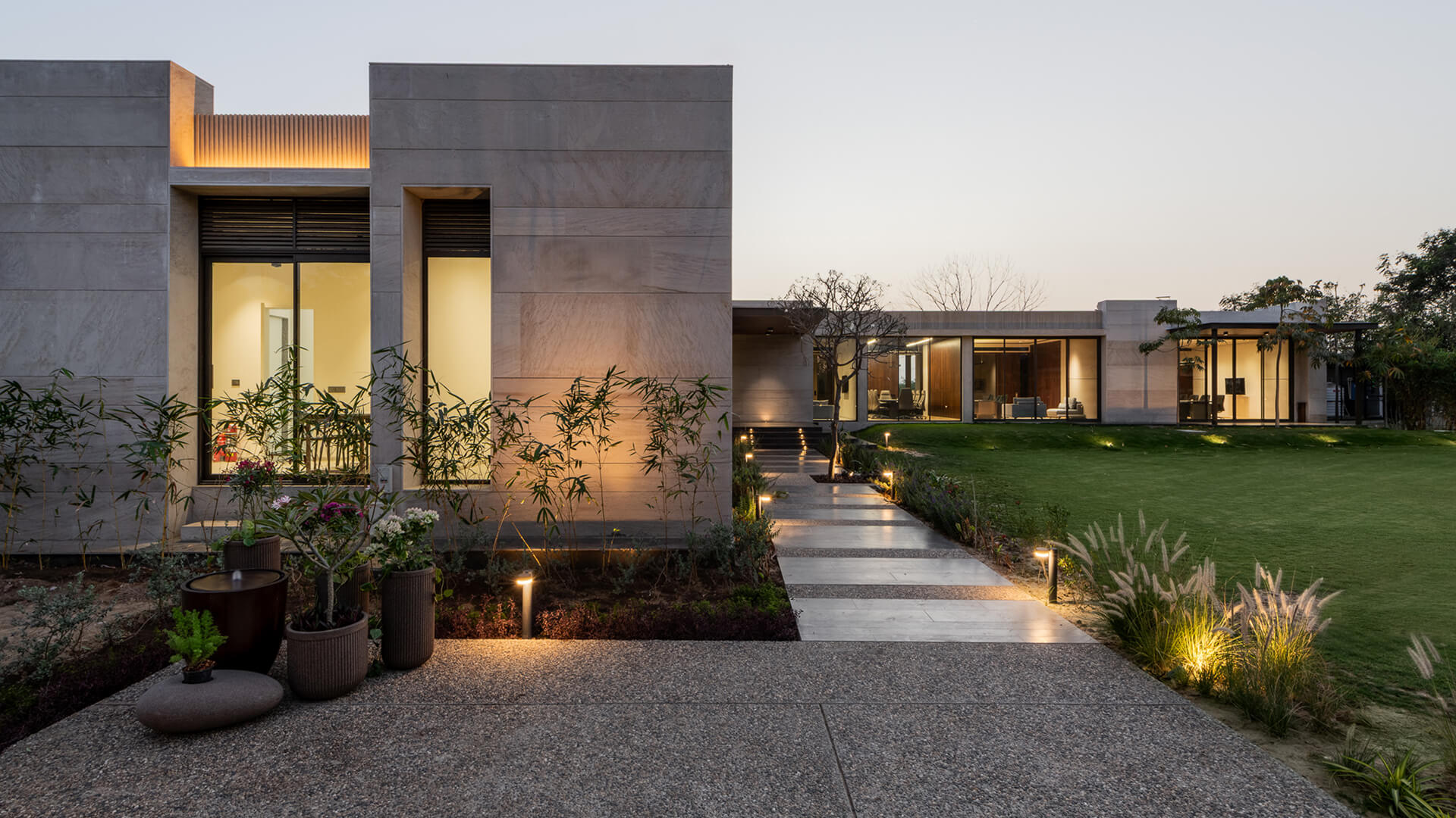
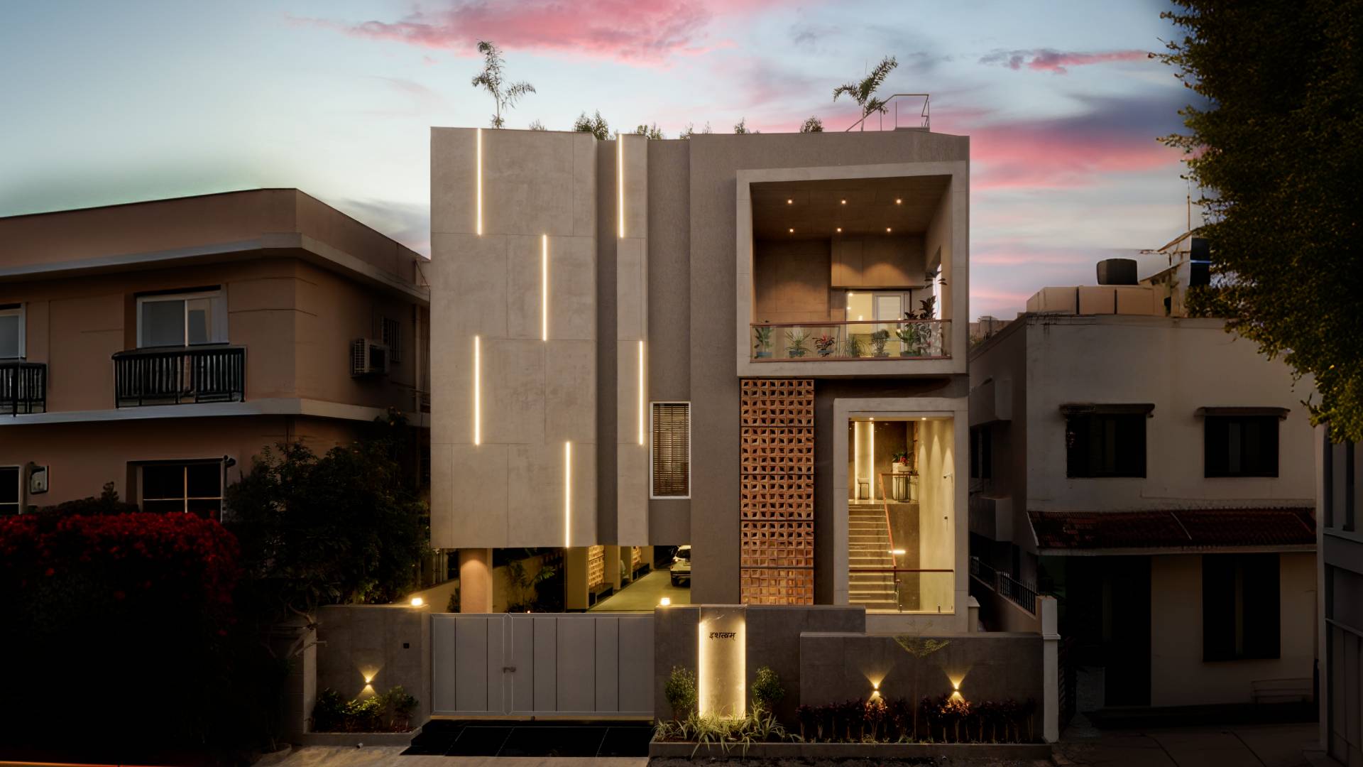
In Vadodara, a+t associates reimagines the idea of balance through The Brick Twins: two residences that mirror each other yet retain their individuality, embodying duality under one refined architectural skin.
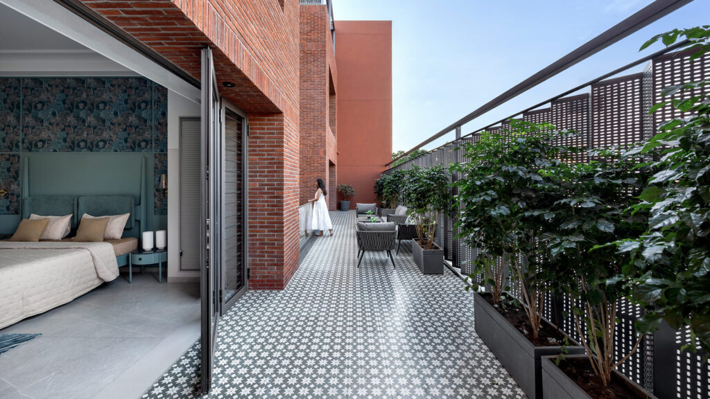
The project is a study in contrast and cohesion: exposed brick and perforated metal screens convey rhythm and structure, while soft interiors and neutral palettes bring calm and intimacy.
At the core of this dialogue, Nexion’s sintered surfaces ground the design in material harmony and visual balance, reflecting a quiet sophistication that defines the project’s identity.
Balance as an active dialogue between symmetry and contrast
In The Brick Twins balance is an active conversation between form, material, and lifestyle.
Each bungalow reflects the other without imitation: façades align, proportions echo, yet every interior unfolds its own rhythm and personality.
This interplay between mirroring and independence defines the project’s architectural language as a narrative of coexistence, where precision meets emotion.
As Architects Archis Patel and Tanvi Rajpurohit explain, “The twin homes don’t just mirror each other — they reflect a deeper philosophy: of balance, duality, and coexisting identities under one elegant skin.”
Through this vision, The Brick Twins becomes more than a pair of homes, but a narrative of coexistence, where precision meets emotion, and symmetry evolves into living architecture.
Material contrast as a language of harmony
In these refined twin homes, materials are not chosen to compete, but to collaborate. The project’s palette with exposed brick, corten-inspired plaster, perforated metal, and Nexion’s sintered surfaces, weaves together roughness and refinement, warmth and restraint, in a seamless interplay of textures.
Brickwork grounds the architecture in tactility and permanence, celebrating craftsmanship and authenticity. Metal screens, by contrast, introduce rhythm and porosity, softening the mass and inviting light.
Between these extremes, ceramic surfaces offer calm continuity, balancing the composition with clarity and coherence.Here, contrast itself becomes a language of harmony, a conversation between craft and geometry, where every surface contributes to equilibrium and timeless character.
Spatial harmony: light, geometry & proportion
Balance is embedded in the geometry of the homes. The twin structures share aligned façades and mirrored proportions, yet subtle variations in layout and light transform repetition into rhythm.
A central void acts as both connector and divider, channeling daylight through the interiors and creating a fluid dialogue between the two volumes.
Vertical cut-outs and perforated metal screens project shifting shadows across the walls, animating the space with the passage of time.
Against this dynamic backdrop, Nexion’s sintered surfaces reflect natural light with refined restraint, amplifying spaciousness while maintaining a sense of calm.
The result is architecture that feels alive yet composed, where proportion guides perception and light becomes an essential design element.
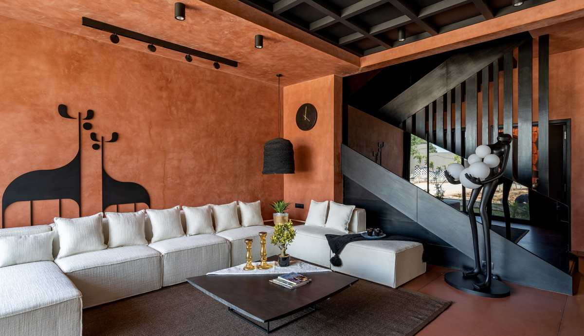
Interiors shaped by geometry and comfort
Inside, the language of symmetry transitions into one of comfort and tactility. Neutral tones and tactile finishes create continuity, while accents of sage green, ochre, and blue add subtle depth and individuality.
Nexion’s sintered flooring serves as the visual connector throughout, a continuous, elegant surface that flows seamlessly between public and private areas.
The tiles’ soft sheen enhances brightness, offering a counterpoint to the raw texture of brick and the cool precision of metal.
Each room reflects a balance between geometry and emotion, where materials and proportions converge to create a serene, human-centered living environment.
The role of Nexion sintered surfaces
Within this architectural dialogue, Pietra Grey sintered surfaces play a quiet yet defining role. Chosen for their timeless elegance and refined materiality, these surfaces anchor the interiors with balance, proportion, and light.
The stone’s deep grey base and delicate white veining introduce visual depth without overwhelming the space, complementing both the warmth of brick and the precision of metal detailing.
Nexion’s reinterpretation enhances the marble’s natural beauty through subtle tonal calibration, ensuring continuity and versatility across surfaces.
By integrating crystalline details within the veining, the material captures and softens light, creating a sense of understated luxury that reinforces the project’s architectural rhythm.
With Pietra Grey grounding the composition, The Brick Twins project achieves its defining equilibrium: timeless, tactile, and profoundly human.
Inspired by this design transformation?
Discover more architectural stories in the Project Section of our Nexion Club and explore how designers and architects use Nexion’s sintered surfaces to craft spaces that balance beauty, resilience, and human connection.